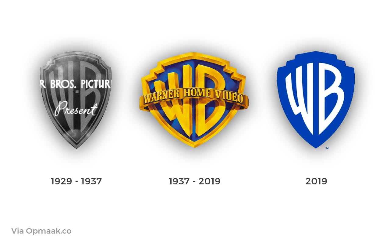
The readers of this blog would know how big of a follower of minimalism I am. But recently, I heard a statement in against to minimalism. That person told me how minimalism was disregarding or undermining the essence of true art. He provided the example of the change in the logo of Warner Bros. :

And honestly, their previous logo was much better. They eliminated the borders which just made it seem less outlined and defined. True, the new logo does seem to follow the philosophy of minimalism but, it lacks something.
Even when you search "minimalism" on google or Unsplash, the results in my opinion, are highly disappointing. A minimalistic themed image seems to lack the colors, the vibe or the fun in life. The classical minimalistic themed image is a sole logo or object with a plain colored background, such as the following:

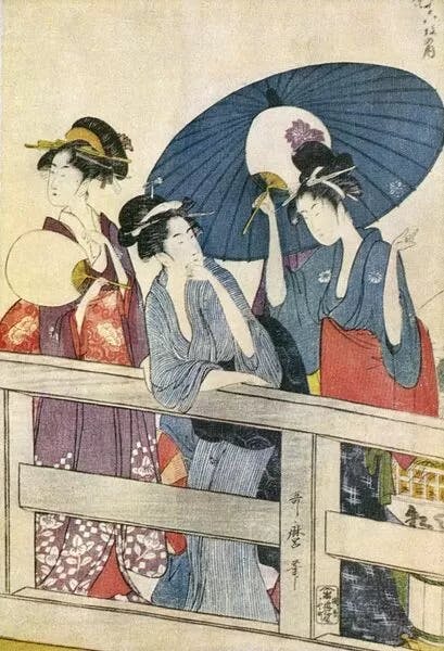
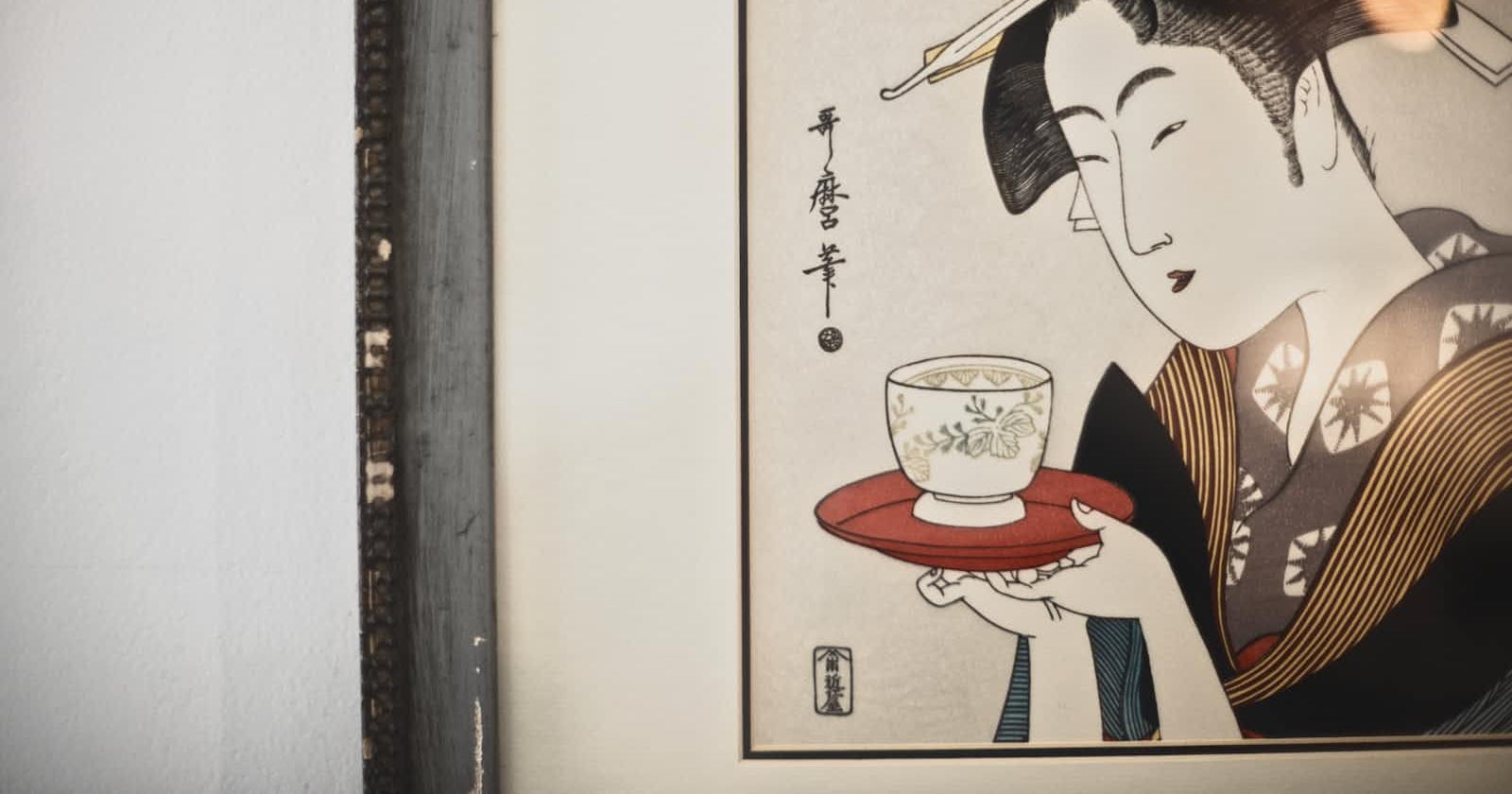
And this is a mistake most of us make. Minimalism is not always black and white! It too can be filled with colors. A minimalistic artwork is a work of prioritization. The message you are trying to convey is clear, it's visible and comprehensible to the viewer. Kitagawa Utamaro's paintings are the perfect example for this. His "ukiyo" styled artworks depict the daily life of a Japanese person:

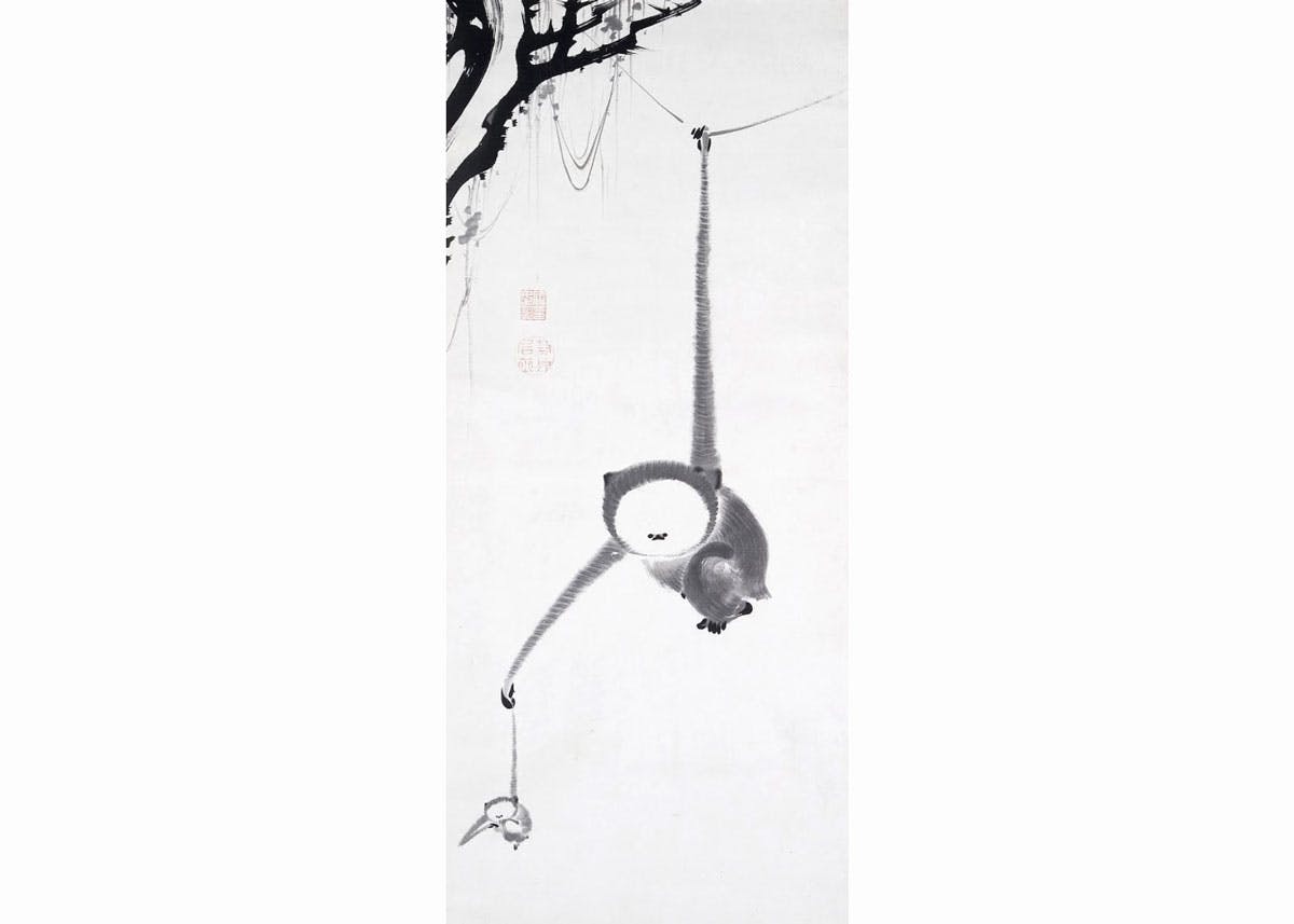
Another interesting example is the Zen art. I recently dwelled into it and realized how precise an artwork could be. Each artwork, each touch of brush depicts meaning. It may not always be comprehensible but it's trying to tell you something, teach you something. It's beautiful.

Artistic minimalism is precision, it's perfectionism. It's simplicity and authenticity is what makes it remarkable and unique.

